In 2020, I created the PCF Beginner Guide post, which explains the basics of Power Apps component framework. Since then, there have been numerous changes to the framework, prompting me to write another blog post on React based virtual code components.
Please note that if you are familiar with the term ‘PCF Component’ but not ‘Code Component,’ they both refer to the same concept. I will be using ‘Code Component’ terminology throughout this post.
In this blog post, I will cover the following topics:
- What is a Standard code component
- What is a React based virtual code component
- Differences between React based virtual code component and standard components
- Scenario
- Demo : Creating a React code component and deploying to Dataverse
Lets get started.
What is Standard code component:
- Standard code components are standard html control types.
- Controls are allocated an HtmlDivElement in it’s init lifecycle method and mounts its UX/UI inside the allocated Div directly working on DOM.
- Please refer to this article for a detailed understanding of standard components.

What is a React based virtual code component:
- Virtual or React based virtual code components are built using the React framework.
- React apps are made out of components.
- A component is a piece of the UI (user interface) that has its own logic and appearance
- React (virtual) controls provide a new pattern optimized for using React library in code components.

- If you are not clear at this point, don’t worry; you will understand during the next sections.
Differences Between React based virtual code component and Standard code components:
- Virtual code components can have performance gains which are at par with some of the 1st party controls.
- You can expect much better performance across web and mobile, especially on slower networks.
- Following are some high-level numbers comparing standard and virtual versions of FacePile control on development machine.

- As you can see from the statistics above, in React-based code components, the React and Fluent libraries aren’t included in the package because they’re shared. Therefore, the size of bundle.js is smaller.
Now that you have the basics of both Standard and React code components, let’s proceed with our scenario and demo.
Scenario:
- We will be building a simple React component with a ‘Label’ control, which animates the text from left to right.
- Our React component takes 4 parameters
- textcontent
- fontsize
- fontcolor
- animationpace

Now we have the scenario, lets get started with building the component. Please ensure that the prerequisites mentioned here are fulfilled before proceeding with the next steps.
Steps to create a React component project:
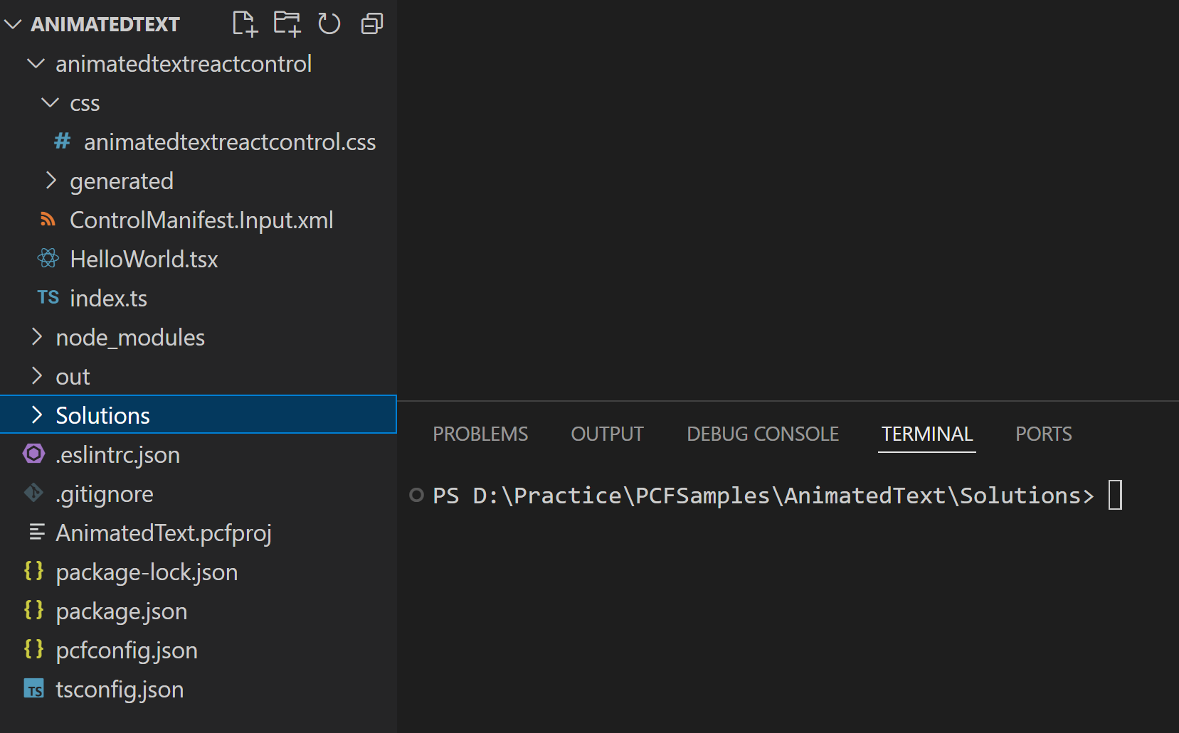
- Create an empty folder as shown below.

- Open the VSCode editor. Navigate to the newly created folder mentioned above and open a new terminal, which should appear as shown below.

- Create a new ‘React Code Component’ project by executing the pac pcf init command with
--frameworkparameter set toreact.
pac pcf init --namespace LearnReactPCF --name animatedtextreactcontrol --template field --framework react -npm
- Above pac pcf init command may take a few seconds to complete execution. Once finished, you will see folders rendered as shown below. You can safely ignore any warnings and proceed with the next steps.

Understand the files of the project:
“Let’s understand the files that were created and the changes made in the index.ts file compared to a standard code component project.
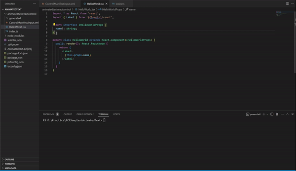
- A new React class component file HelloWorld.tsx gets created, by default returns a simple ‘Label’ control.
- In the index.ts file, The ReactControl.init method for control initialization doesn’t have <
div>parameters because React controls don’t render the DOM directly. - Instead ReactControl.updateView returns a ReactElement that has the details of the actual control in React format.

- An important thing to notice is that an interface IHelloWorldProps will be available in both HelloWorld.tsx and index.ts files. This interface helps you to pass parameters to the react component, which you will see in next sections.
Now that we’ve understood the files and key points, let’s proceed with executing our scenario.
As mentioned in the Scenario section, our animation text component will have four parameters. Let’s start by defining these parameters in the ControlManifest.Input.xml file.
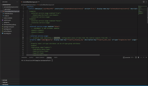
Define properties in ControlManifest.Input.xml file:
- Open the ControlManifest.Input.xml file, delete the default ‘sampleproperty’ node, and add our four parameters (i.e., textcontent,fontsize,fontcolor,animationpace) as shown below.
     <property name="textcontent" display-name-key="textcontent" description-key="content to be displayed" of-type="SingleLine.Text" usage="bound" required="true" />
    <property name="fontsize" display-name-key="fontsize" description-key="fontsize" of-type="SingleLine.Text" usage="input" required="true" />
    <property name="fontcolor" display-name-key="fontcolor" description-key="color of the font" of-type="SingleLine.Text" usage="input" required="true" />
    <property name="animationpace" display-name-key="animationpace" description-key="animation pace" of-type="SingleLine.Text" usage="input" required="false" />
Update the ‘IHelloWorldProps’ interface with new properties:
As we added the four new parameters in ControlManifest.Input.xml file, we need to update the IHelloWorldProps interface with new properties in both HelloWorld.tsx and index.ts files.
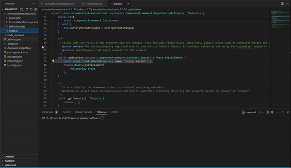
- Open the index.ts file and update the IHelloWorldProps interface with following code block.
    const props: IHelloWorldProps = {
        content: context.parameters.textcontent.raw,
        fontsize: context.parameters.fontsize.raw,
        color: context.parameters.fontcolor.raw,
        animationpace: context.parameters.animationpace.raw
    };
- Next, open the HelloWorld.tsx file and update the IHelloWorldProps interface with following code block.
export interface IHelloWorldProps {
  content?: any;
  fontsize?: any;
  color?: any;
  animationpace?: any;
}
Render the animated control in the react component:
Now that we defined properties, lets read the property values and render our React component.
- Open the HelloWorld.tsx file and replace the default ‘Label’ render logic with below code block.
- In the below code, we have mapped all the four properties from this.props to four constants.
- Next, we defined labelStyle constant with the styling which we have used in <Label style={labelStyle}>
- Finally we are returning the <Label> control using return. This is a standard React component behavior, if you are familiar with React framework.
    const { content, fontsize, color, animationpace = '5s' } = this.props;
    const labelStyle = {
      fontSize: fontsize,
      color: color,
      animation: `moveLeft ${animationpace} linear infinite`
    };

    return (
      <Label style={labelStyle}>
        {content}
      </Label>
    )
- Notice that we are using ‘moveLeft‘ css class to achieve the animated effect. To do this, we need to add a new .css file to our project and define the ‘moveLeft‘ class in it.
Add a new .css file:
- If you open the ControlManifest.Input.xml file, under <resources> node, you will find a commented-out line for the <css> node. Uncomment the line as shown below. Your <resources> node should look like the following:”
    <resources>
      <code path="index.ts" order="1"/>
      <platform-library name="React" version="16.8.6" />
      <platform-library name="Fluent" version="8.29.0" />
      <css path="css/animatedtextreactcontrol.css" order="1" />
      <!-- UNCOMMENT TO ADD MORE RESOURCES
      <resx path="strings/animatedtextreactcontrol.1033.resx" version="1.0.0" />
      -->
    </resources>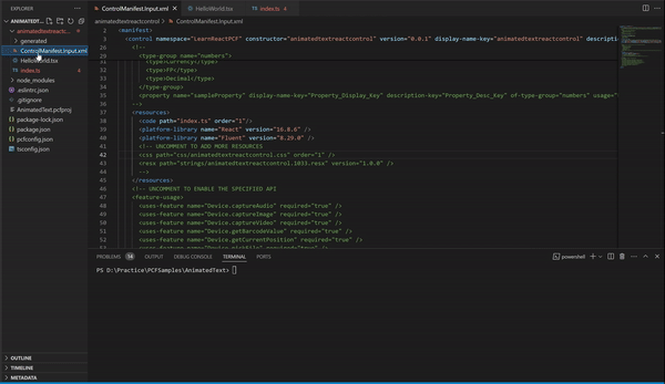
- Now that we’ve uncommented the <css> node, our application expects a new animatedtextreactcontrol.css file under css folder.
- Create a new folder named ‘css’ and add a new file named ‘animatedtextreactcontrol.css’. Then, add the following CSS content to the file:
@keyframes moveLeft {
    0% {
      transform: translateX(0);
    }
    100% {
      transform: translateX(100%);
    }
  }
We are good with configuring the properties and rendering the component. Its time to test.
Build and Test the control:
- Build the project by trigger the npm run build command and ensure that it returns ‘Succeeded’ to confirm successful completion.

- Next trigger npm start watch command to test the control.

- The npm start watch command opens a browser window where you can test the control by providing values to its properties directly in the browser interface.

Packaging the code components:
Now that we built and tested the react virtual control, lets package it in to a solution which enables us to transport the the control to Dataverse.
- Create a new folder named Solutions inside the AnimatedText folder and navigate into the folder.
- Create a new Dataverse solution project by triggering the pac solution init command.
- The publisher-name and publisher-prefix values must be the same as either an existing solution publisher, or a new one that you want to create in your target environment.
pac solution init –publisher-name Rajeev –publisher-prefix raj
- After executing the above ‘pac solution init’ command, a new Dataverse solution project with a .cdsproj extension is created
- Now, we need to link our ‘react code component’ project location (i.e., pcfproj file location) to the newly created Dataverse solution project using pac solution add-reference command.
pac solution add-reference –path D:\Practice\PCFSamples\AnimatedText

- We left with one last pac cli command. Generate the Dataverse solution file, trigger following msbuild command.
msbuild /t:build /restore
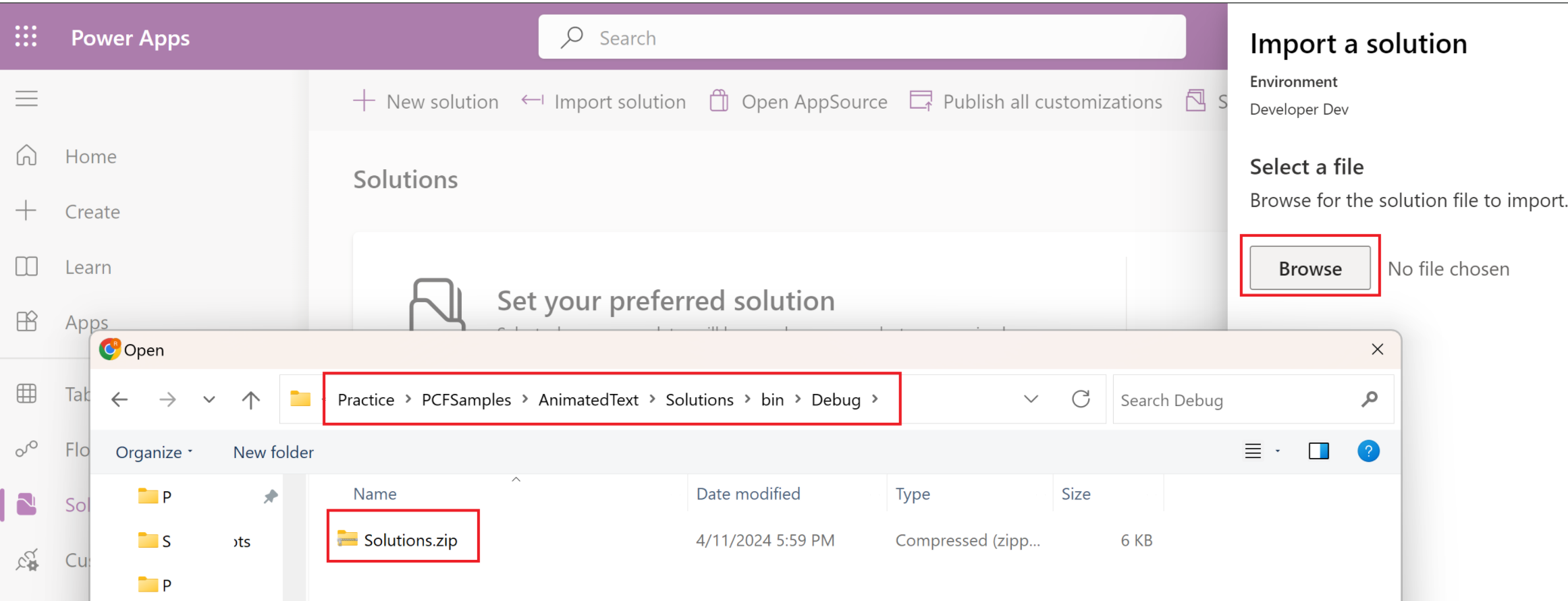
- Post successful build, generated Dataverse solution zip file will be located in the
Solutions\bin\debugfolder.- Note that the solution zip file name will be same as the root folder (i.e., Solutions)

As we successfully built the control and generated a Dataverse solution, lets import the solution to an environment and test the control using a Canvas app.
Import the solution to Dataverse:
- Connect to the Power Apps Maker portal.
- Select an environment and import the generated solution.
- Post the solution import, open the solution and click on Publish all customizations.

Test the component in Canvas App:
- Lets create a new Canvas app to test our react code component.
- From the new Canvas app, import our react code component as shown below.

- Test the control with different parameter values as shown below.

Test the component in Model Driven App (MDA):
We can add our ‘Animated Text’ react component to any of the table’s control. I am going to use Account table to test.
- Open the Account > Forms > Information form
- I am going to replace the default Account Name control with our React component.
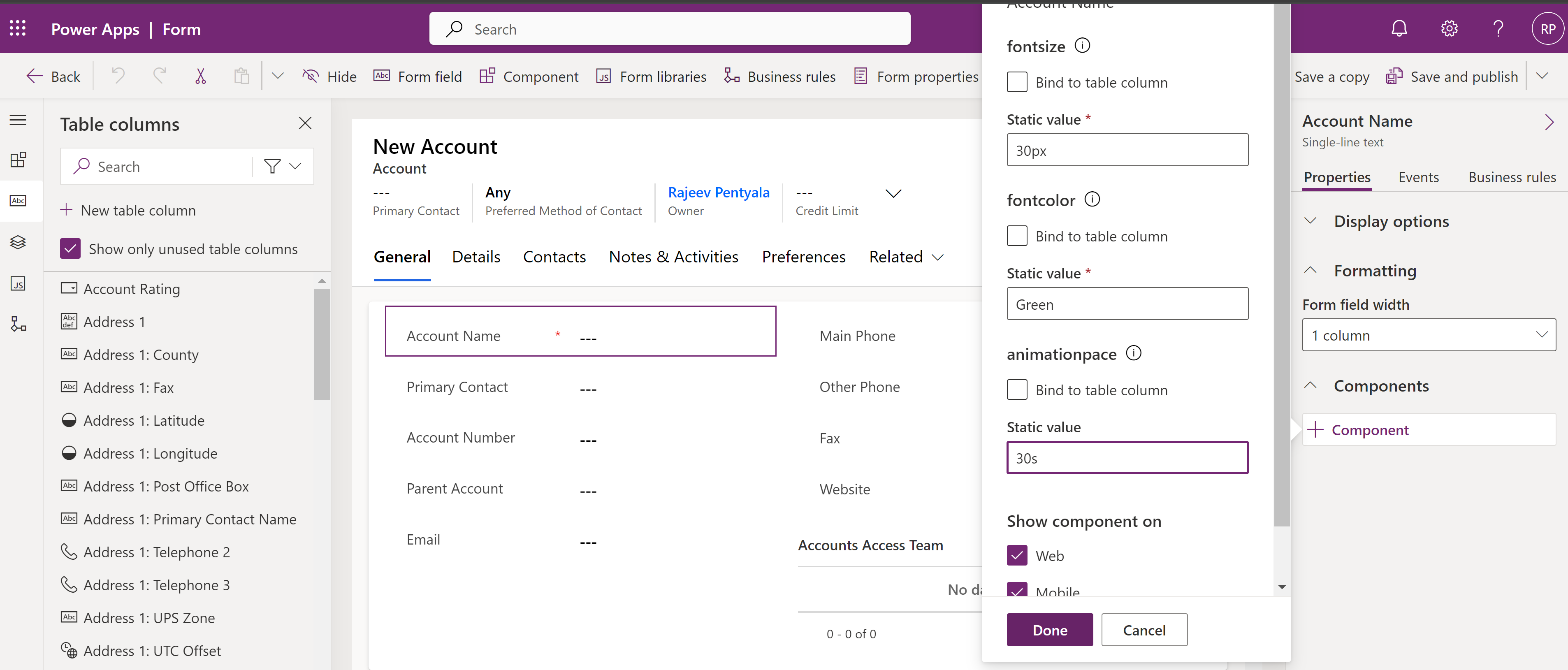
- Select the Account Name control and map to our React component as shown below.
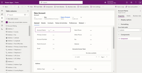
- Now go ahead and specify the properties and click on Done
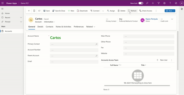
- Now, open any of the Account record and you will see the Account Name default control replaced with our animated React component.
That’s it. You can also add this component to Power Pages as well.
Hope you got the basics of creating React Virtual Code Component. Happy learning.
🙂
 Rajeev Pentyala – Technical Blog on Power Platform, Azure and AI
Leave a comment