Components
In Power Apps, Components are reusable building blocks for canvas apps so that app makers can create custom controls to use inside an app.
- Components scope is local, which means you can create a Component in an App and can reuse with in the screens of that particular App.
Component Library
Component Libraries (Currently in preview) are the recommended way to reuse components across apps.
Unlike the ‘Component’ whose scope is limited with in the App, ‘Component Libraries’ can be reused across the Apps.
In this article, we are going to learn following topics
- Create a new ‘Component Library’ with ‘Header’ and ‘Footer’ components.
- Share the ‘Component Library’
- Use the ‘Component Library’ in Canvas App
- Modify the ‘Component Library’
- Update ‘Component Library’ in Canvas App.
Lets get started with Prerequisites.
Prerequisites:
- PowerApps account. Refer here to get an account.
Once you fulfill the Prerequisites, lets get started with first step.
Create a new ‘Component Library’ with ‘Header’ and ‘Footer’ components:
- Connect to Power Apps maker portal
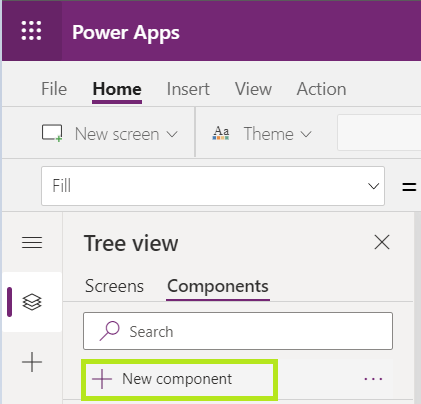
- From the ‘Apps’ tab, click on ‘New component library’.

- Provide the name and click on ‘Create’.

- As we know ‘Component Library’ is collection of reusable ‘Components’, In the next screen, a default ‘Component’ would be presented.
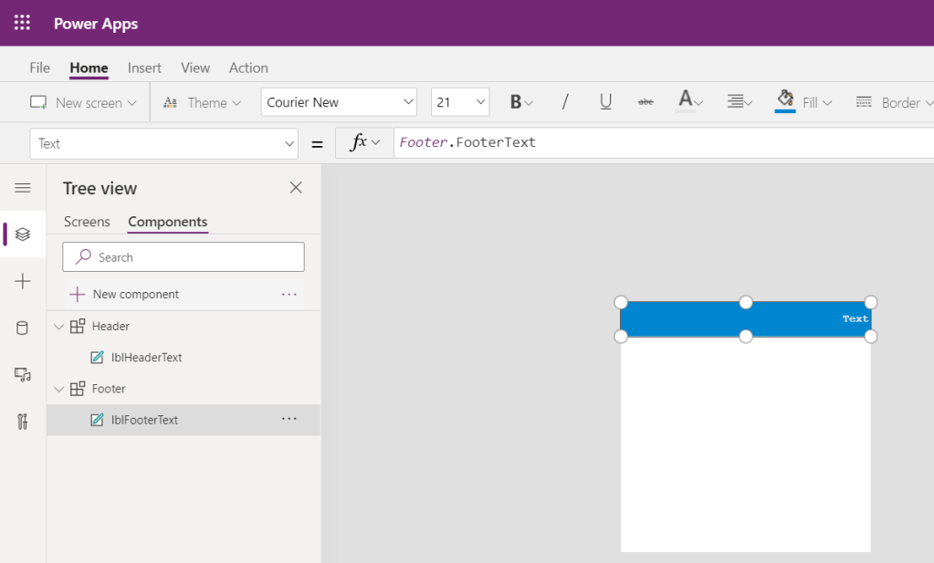
- Rename the default Component to ‘Header’.
- Add a Label control ‘lblHeaderText’, as shown in the screen.

- Add a new ‘Custom property’ of type ‘Text’ and name it as ‘Header Text’.
- A component can receive input values and emit data if you create one or more custom properties.

- Set the Label controls ‘Text’ property to the ‘Header Text’ property.
- ‘Header Text’ property will be handy while referring the components in ‘Canvas’ apps.

- Also set the ‘Header’ components ‘Width’ property to the ‘App.ActiveScreen.Width’.
- App.ActiveScreen.Width sets the width of Components as per the Canvas app.

- Lets copy the ‘Header’ component using the ‘Duplicate component’ option, and create ‘Footer’ component.

- I’ve added a Label and new ‘Custom property’ of type ‘Text’ and name it as ‘Footer Text’, as shown in screen below.
- Save the ‘Component Library’.
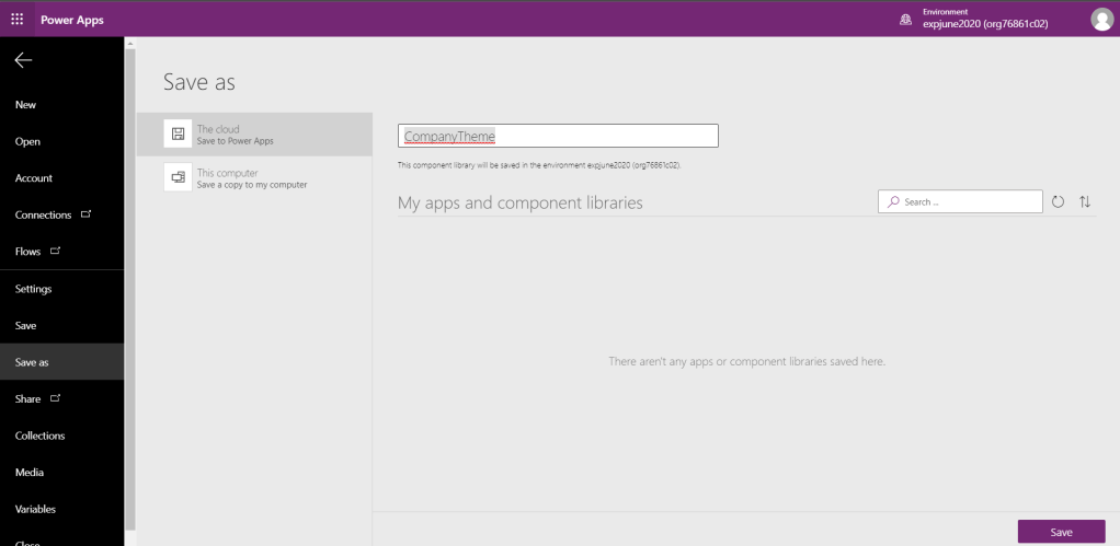
- In the maker portal ‘Component Library’ would show up.

Share the ‘Component Library’:
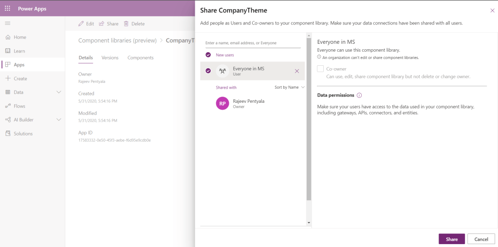
Now that we created the ‘Component Library’, we need to share the App.
- Post the ‘Save’, click on ‘Share’.

- Add people you would like to share. I’ve shared the Component Library with ‘Everyone’ in my account.
Use the ‘Component Library’ in Canvas App:
As we created the ‘Component Library’ lets put that in use by creating a Canvas app.
- Create a new Canvas app.
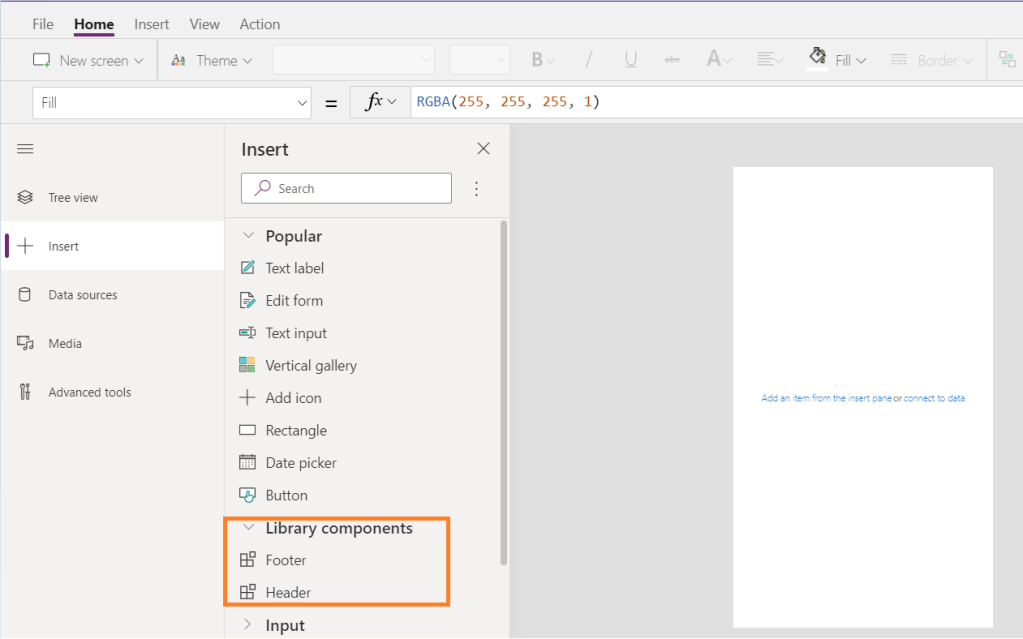
- To add the ‘Component Library’, click on ‘+ Insert’ and ‘Get more components’.

- From the list choose the ‘Components’.
- You would get the ‘Components’ those were shared to you.

- Added ‘Components’ would be available under ‘Library Components’.
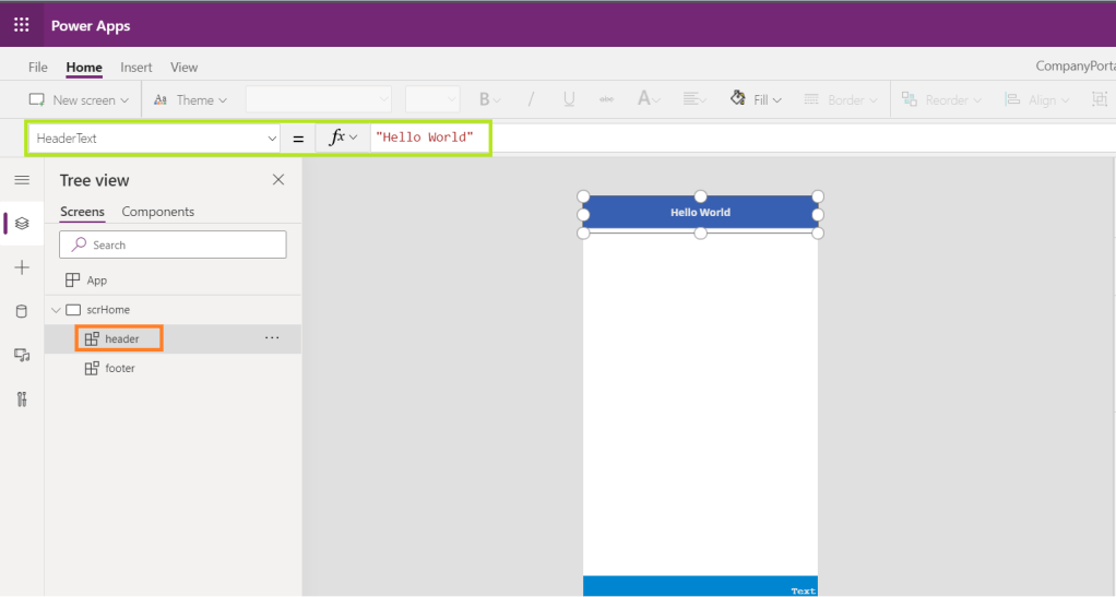
- Add both ‘Header’ and ‘Footer’ Components to the Canvas app’s screen.
- Set the ‘HeaderText’ property of the ‘Header’ component. This would immediately changes your Header label text.
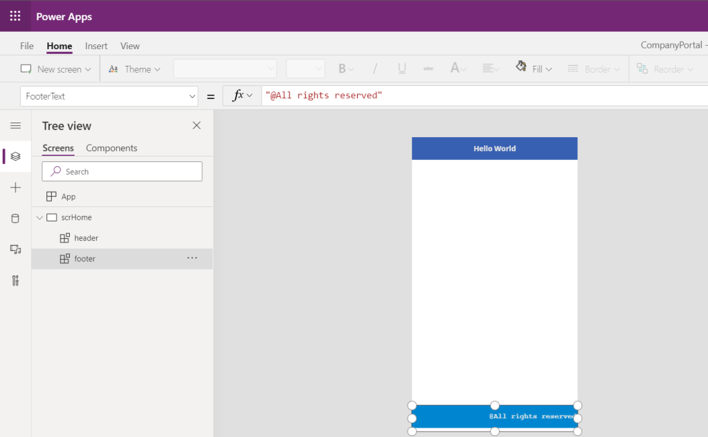
- Similarly, Set the ‘FooterText’ property of the ‘Footer’ component. This would immediately changes your Footer label text.
Modify the ‘Component Library’:
Lets modify the ‘Component Library’ and see how it reflects in the Canvas App.
- Change the background color of the ‘Header’ component.

- Save and Publish.
- Go to ‘Canvas App’ and you would notice banner as below.
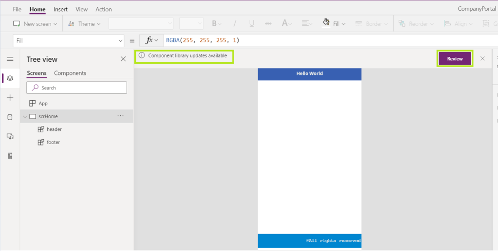
- Click on ‘Review’ and click on ‘Update’ to get the latest Component updates.
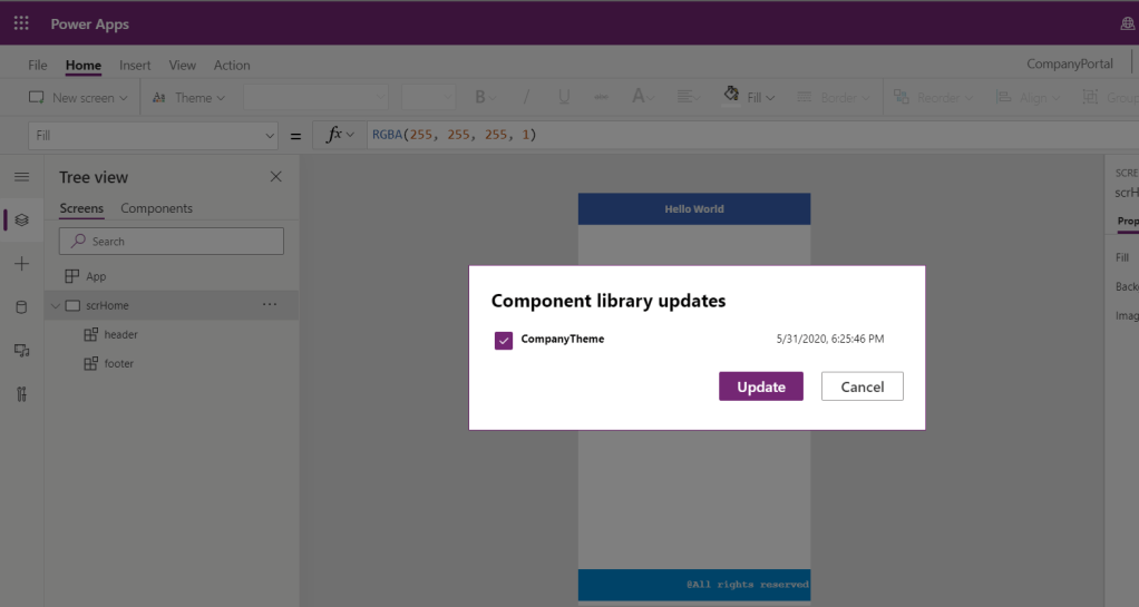
- Canvas apps Header changes as below.

Notes:
- Sharing a component library works the same way you share a canvas app.
- When you share a component library, you allow others to reuse the component library.
- Once shared, others can edit the component library and import components from this shared component library for creating and editing apps.
- If shared as a co-owner, a user can use, edit, and share a component library but not delete or change the owner.
- You can’t add existing component libraries to a solution. However, you can create new component libraries for solutions using add component library flow.
- You can’t access controls in the component from outside of the component.
- You can’t refer to anything outside of the component from inside the component. The exception is data sources shared between an app and its components
🙂

 Rajeev Pentyala – Technical Blog on Power Platform, Azure and AI
Leave a comment